Work with models
Here is an example* of work with the Cadbiom API to process entities and transitions stored in a Cadbiom model.
*: see notes at the end of this page.
Model handling
Load the model
[1]:
%matplotlib inline

# Fix print function for Dino-Python
from __future__ import print_function
#import mpld3
##mpld3.enable_notebook(local=True) # currently not happy
#mpld3.enable_notebook()
[2]:
# Import the Cadbiom parser
from cadbiom.models.guard_transitions.translators.chart_xml import MakeModelFromXmlFile

def load_model(model_path):
    """Load a model from a model file"""
    parser = MakeModelFromXmlFile(model_path)
    return parser.model

model = load_model("_static/demo_files/models_mars_2020/model_pid_without_scc.bcx")
Extract data
The model obtained is of the ChartModel type described in the documentation.
Transitions are available via the attribute transition_list, and places or nodes are available via the attribute node_dict.
Here we are interested in boundaries of the model…
[3]:
def get_boundaries(model):
    """Build boundaries set from the model

    Boundary = a place without incoming transition
    Boundaries of the model = all places - places with incoming transitions

    :return: Set of boundaries
    :rtype: <set>
    """
    all_biomolecules = set(model.node_dict.keys())
    outgoing_biomolecules = set(transition.ext.name for transition in model.transition_list)

    boundaries = all_biomolecules - outgoing_biomolecules

    return boundaries

boundaries = get_boundaries(model)
Filter data
At this point we are interested in the locations of the boundaries elements by focusing on the complex type elements. Each place in the model has metadata serialized as JSON (http://www.json.org) and accessible via the attribute note of these objects. This attribute is described in the Cadbiom file format specification.
[4]:
import json
from collections import Counter

locations_count = Counter()
for boundary in boundaries:
    try:
        json_data = json.loads(model.node_dict[boundary].note)
    except ValueError:
        # Absence of metadata
        if "__start__" in boundary:
            # Skip virtual nodes
            continue
        json_data = dict()

    # Filter complexes
    if json_data.get("entityType") != "Complex":
        continue

    # Unknown location
    locations_count[json_data.get("location", "unknown")] += 1

print("Retrieved locations:", locations_count)

# Calculation of the respective percentages of each location
nb_locations = sum(locations_count.values())
locations_percents = {k: float(v * 100) / nb_locations for k, v in locations_count.items()}

print("Locations percentages:", locations_percents)
Retrieved locations: Counter({'unknown': 519, u'integral to membrane': 124, u'nucleus': 118, u'cytoplasm': 75, u'plasma membrane': 59, u'extracellular region': 52, u'cell-cell junction': 12, u'basement membrane': 8, u'endosome': 5, u'early endosome': 5, u'membrane raft': 5, u'Golgi to ER transport vesicle membrane': 4, u'Golgi apparatus': 3, u'basolateral plasma membrane': 3, u'chromosome': 2, u'extracellular matrix': 2, u'centrosome': 2, u'cell leading edge': 2, u'chromatin': 2, u'trailing edge': 2, u'spindle midzone': 1, u'mitochondrion': 1, u'adherens junction': 1, u'tight junction': 1, u'caveola': 1, u'nucleolus': 1, u'dendritic spine': 1, u'perinuclear region of cytoplasm': 1})
Locations percentages: {u'endosome': 0.49407114624505927, u'Golgi apparatus': 0.2964426877470356, u'cytoplasm': 7.41106719367589, u'spindle midzone': 0.09881422924901186, u'chromosome': 0.1976284584980237, u'basement membrane': 0.7905138339920948, u'early endosome': 0.49407114624505927, u'mitochondrion': 0.09881422924901186, u'adherens junction': 0.09881422924901186, u'plasma membrane': 5.830039525691699, u'extracellular matrix': 0.1976284584980237, u'extracellular region': 5.138339920948616, 'unknown': 51.284584980237156, u'Golgi to ER transport vesicle membrane': 0.3952569169960474, u'membrane raft': 0.49407114624505927, u'cell leading edge': 0.1976284584980237, u'tight junction': 0.09881422924901186, u'chromatin': 0.1976284584980237, u'cell-cell junction': 1.1857707509881423, u'dendritic spine': 0.09881422924901186, u'basolateral plasma membrane': 0.2964426877470356, u'nucleus': 11.660079051383399, u'centrosome': 0.1976284584980237, u'nucleolus': 0.09881422924901186, u'trailing edge': 0.1976284584980237, u'integral to membrane': 12.25296442687747, u'caveola': 0.09881422924901186, u'perinuclear region of cytoplasm': 0.09881422924901186}
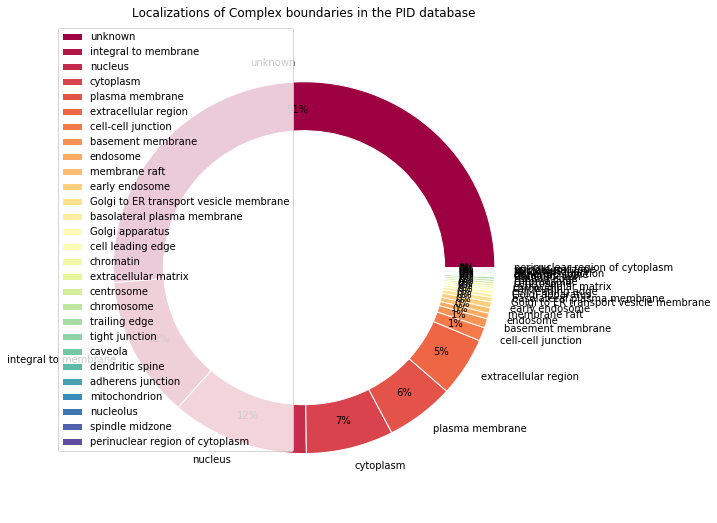
Display: Pie charts visualization
The data must be ordered in descending order to display properly. Let’s make a function in order to avoid code duplication.
[5]:
import pandas as pd
import matplotlib.pyplot as plt

def make_pandas_pie_chart(locations_percents, nb_values=None, legend=True, title=""):
    """Display pie chart with the help of pandas

    :key nb_values: Number of boundaries considered (for the title)
    :key legend: Enable the legend (default: True)
    :key title: Figure title
    :type nb_values: <int>
    :type key: <boolean>
    :type title: <str>
    """
    # Title formatting
    title = title % nb_values if nb_values else title

    # Sort values in descending order
    series = pd.Series(
        data=locations_percents.values(),
        index=locations_percents.keys(), name=""
    ).sort_values(ascending=False)

    # Draw pie chart
    size = 0.25
    plot = series.plot.pie(
        legend=legend,
        autopct='%1.0f%%',  # Cut percentages after the decimal point
        pctdistance=0.85,
        colormap="Spectral",  # Pastel1, Set2, Spectral
        radius=1.2-size,  # Fix size for the central circle
        wedgeprops=dict(width=size, edgecolor='w'),  # Draw central circle
        figsize=(9, 9),
        title=title,
    )


make_pandas_pie_chart(
    locations_percents,
    title="Localizations of Complex boundaries in the PID database"
)

Data cleaning
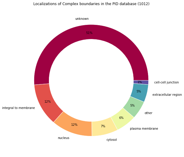
The data is somewhat noisy, let’s try to group together the less frequent locations, and similar locations together.
Note that the computation of percentages is not mandatory for the pie chart but it allows us to remove the smallest locations easily.
[6]:
nb_locations = sum(locations_count.values())

# Calculation of the respective percentage of each location
# Compute percent and group items
locations_percents = Counter()
for location, count in locations_count.items():
    percentage = float(count * 100) / nb_locations

    if percentage > 1:
        # Merge similar groups
        if "unknown" in location:
            locations_percents["unknown"] += percentage
        elif "cyto" in location:
            locations_percents["cytosol"] += percentage
        else:
            locations_percents[location] = percentage
    else:
        # Merge less frequent groups
        locations_percents["other"] += percentage

print("Locations percentages:", locations_percents)
Locations percentages: Counter({'unknown': 51.284584980237156, u'integral to membrane': 12.25296442687747, u'nucleus': 11.660079051383399, 'cytosol': 7.41106719367589, u'plasma membrane': 5.830039525691699, 'other': 5.237154150197627, u'extracellular region': 5.138339920948616, u'cell-cell junction': 1.1857707509881423})
[7]:
# Reuse the function previously defined
make_pandas_pie_chart(
    locations_percents,
    nb_values=nb_locations,
    legend=False,
    title="Localizations of Complex boundaries in the PID database (%s)"
)

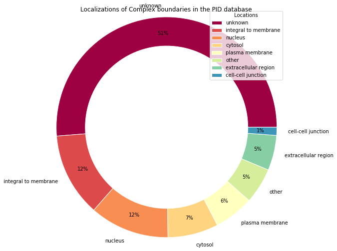
Pie chart alternative with Matplotlib
Pandas is many things and it is also an overlay to Matplotlib when it comes to data visualization.
Here is an alternative written entirely with Matplotlib, so you can easily spot the few verbose overloads that Pandas erases with a certain elegance.
[8]:
from operator import itemgetter
from numpy import arange
from matplotlib import cm

# Data must be sorted before use
sorted_locations = sorted(locations_percents.items(), key=itemgetter(1), reverse=True)
unzip = lambda l: list(zip(*l))
locations_names, values = unzip(sorted_locations)

# Colors must be pre computed from colormap
# The goal is to generate 1 color taken at regular intervals for each element
# Build an array having the size n of the data to be displayed,
# and containing the values from 0 to n-1;
# Divide each value by n
colors=cm.Spectral(arange(len(locations_percents)) / float(len(locations_percents)))

# Draw pie chart
fig, ax = plt.subplots()
size = 0.25
wedges, texts, autotexts = plt.pie(
    values, labels=locations_names,
    pctdistance=0.85,
    autopct='%1.0f%%',
    colors=colors,
    radius=1.2-size,  # Fix size for the central circle
    wedgeprops=dict(width=size, edgecolor='w'),  # Draw central circle
)

# Draw the legend
plt.legend(
    wedges, locations_names,
    title="Locations",
    loc="upper right",
    bbox_to_anchor=(0.5, 0.5, 0.5, 0.5)
)

# Set title
fig.suptitle("Localizations of Complex boundaries in the PID database")

# Adjust size
fig.set_size_inches(7, 7)

# Equal aspect ratio ensures that pie is drawn as a circle
plt.axis('equal')
plt.tight_layout()

Another database
A little tidying up
Now we have a function to load a Cadbiom model: load_model(), a function to display data make_pandas_pie_chart(). Let’s do a function for filtering boundaries.
[9]:
def filter_complex_boundaries(model):
    """Filter Complex boundaries from the given model and return their locations.

    - Keep Complexes
    - Merge unknown and cytosol locations
    - Merge smallest locations < 1%

    :return: Tuple: Dict of locations with location names as keys and the number
        of percentages as values; + Number of boundaries considered.
    :rtype: <dict <str>:<int>>, <int>
    """
    # Get boundaries set
    boundaries = get_boundaries(model)

    locations_count = Counter()
    for boundary in boundaries:
        try:
            json_data = json.loads(model.node_dict[boundary].note)
        except ValueError:
            # Absence of metadata
            if "__start__" in boundary:
                # Skip virtual nodes
                continue
            json_data = dict()

        # Filter on Complexes
        if json_data.get("entityType") != "Complex":
            continue

        # Unknown location
        locations_count[json_data.get("location", "unknown")] += 1

    print("Retrieved locations:", locations_count)


    nb_locations = sum(locations_count.values())

    # Calculation of the respective percentages of each location
    # Compute percent and group items
    locations_percents = Counter()
    for location, count in locations_count.items():
        percentage = float(count * 100) / nb_locations

        if percentage > 1:
            # Merge similar groups
            if "unknown" in location:
                locations_percents["unknown"] += percentage
            elif "cyto" in location:
                locations_percents["cytosol"] += percentage
            else:
                locations_percents[location] = percentage
        else:
            # Merge less frequent groups
            locations_percents["other"] += percentage

    print("Locations percentages:", locations_percents)

    return locations_percents, nb_locations
ACSN database
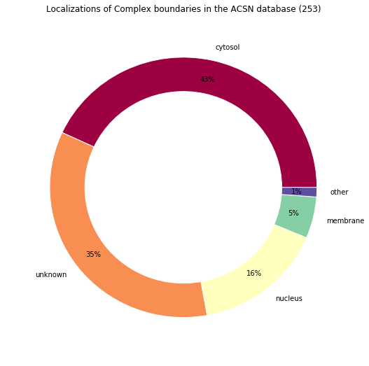
Let’s try our new workflow on another model…
[10]:
make_pandas_pie_chart(
    *filter_complex_boundaries(
        load_model("_static/demo_files/models_mars_2020/model_acsn_without_scc.bcx")
    ),
    legend=False,
    title="Localizations of Complex boundaries in the ACSN database (%s)"
)
Retrieved locations: Counter({u'cellular_component_unknown': 88, u'cytosol': 74, u'nucleus': 40, u'cytoplasm': 35, u'membrane': 13, u'mitochondrion': 2, u'lysosome': 1})
Locations percentages: Counter({'cytosol': 43.08300395256917, 'unknown': 34.78260869565217, u'nucleus': 15.810276679841897, u'membrane': 5.138339920948616, 'other': 1.1857707509881423})

Notes
About the use of Jupyter showed in this page:
Jupyter is a fancy tool but it allows to execute Python code block by block, in a global context (i.e., with variables that persist and will be mutated in that context, execution after execution). This is a very bad working practice that is however encouraged by this kind of tool and by IDEs unfortunately offered to beginners (Spyder for example).
These methods are directly inherited from the practices of the community using the R language and the RStudio “IDE”. To avoid side effects such as persistence of variables, one MUST reset the console/notebook between runs by reloading the kernel as often as possible. Whilst this may seem redundant or heavy, it’s an extremely effective method of reducing unwanted side effects and bugs in your code.